Sunday, August 21, 2016

Design & Style


I feel like these words tend to be used indiscriminately in the visual narrative arts, especially with regards to animation and film. I commonly hear highly-stylized or VFX-heavy films described as well-designed, while I rarely hear films with little stylization or VFX described as well-designed. It’s as though design is used as a measure of the amount or quality of visual style rather than as a measure of how visuals serve the story. 

Perhaps this is because overt stylization and visual design is easy to identify and appreciate, largely in part to the continuing advancement and proliferation of CGI that spurns filmmakers and storytellers into the race for ever more complex and impressive visuals. What this seems to be doing for design, however, is tying it to the output of these tools, so that in this particular view, an epic science fiction film like The Phantom Menace is considered a better designed film than its 22-year predecessor, A New Hope, and both of these films are far better designed than a low-budget independent film like Sideways.

Star Wars I The Phantom Menace ©1999 Twentieth Century Fox Films

Star Wars IV: A New Hope ©1977 Twentieth Century Fox Films


Sideways ©2004 Fox Searchlight Films

By this assertion Hollywood should be cranking out ever and ever better-designed films. Take a look at the marked improvement of design between the latest Independence Day and the original. Or take Transformers, or Teenage Mutant Ninja Turtles. The newer films are so much better designed.

Independence Day/Independence Day Resurgence ©1996/2016 Twentieth Century Fox Films
Transformers/Transformers Age of Extinction ©2007/2014 DreamWorks Picture/Paramount Pictures
Teenage Mutant Ninja Turtles ©1990/2016 Paramount Pictures

But here is where the fallacy lies: design is not a volume dial for visual complexity, sophistication or stylization, and turning it to 11 does not make a design any better than 10, or 9, or even 1. Instead I propose that design is worse in the face of the ‘more is better mentality’ and that The Phantom Menace is the least successfully designed film next to either A New Hope or Sideways. I would even go so far as to say Sideways is the best designed of the three, but I'll save my rationale for the end.

To be fair, design and style are certainly subjective affairs with many different approaches and interpretations. Additionally, these problems with design as I see them are not simply symptoms of over-design, but more often than not reflect of a deficit of storytelling, and in many cases are presented as a substitute for storytelling. Although I am presenting my own personal ideas on the relationship of design to style, my intent is not to just asset my own nerdy opinions, but hopefully to stir thought and conversation.

But first my opinions! Let's start by asking Google how it describes design and style:

design - n. purpose, planning, or intention that exists or is thought to exist behind an action, fact, or material object.    v. decide upon the look and functioning of (a building, garment, or other object), typically by making a detailed drawing of it. 
style - n. a distinctive appearance, typically determined by the principles according to which something is designed.

This is actually pretty close to how I see it:  Design in my mind is a process of understanding and visually representing creative intent, which in the case of cinematic narratives like film or animation usually comes from story. This process begins with asking questions: what is the overall story and overriding themes, how do the constituent parts (characters, settings, plot, etc.), and narrative structural components (acts, scenes, shots, beats, etc.) all serve the greater whole? The execution process then follows with a mixture of research & reference, visual development, conceptual iteration followed by the final execution of informed visual choices. Ideally the design process follows the story process, but in cases where the two happen concurrently design can actually help inform story.

Style, on the other hand, I see as an end product usually informed by some combination of creative intent (story), and artistic voice (aesthetics, taste & judgement). More stylish film-makers tend to put greater emphasis on their own aesthetics and artistic presence, often ending up with recognizable bodies of work informed by a common style or aesthetic—think Quentin Tarantino, Wes Anderson, Tim Burton, David Lynch, and so on.


L to R: Pulp Fiction by Quentin Tarantino, The Grand Budapest Hotel by Wes Anderson, The Elephant Man by David Lynch, Edward Scissorhands by Tim Burton

Where design is successfully balanced between the interests of story and voice, we are left with memorably original, artistic and moving stories. Where there is an imbalance of voice over intent we are often left with stylistically overwrought films that may be interesting to the eye in the moment, but ultimately feel empty, over-whelming or meaningless. I won't show any examples to protect the guilty, but I'm sure everyone has their own examples.

Visual storytellers who work story first tend to place less emphasis on their own artistic presence to allow the unique style and voice rise out of the particular story itself. This is not to say they don’t leave recognizable fingerprints on their work. Every film-maker or storyteller is guided by their own personal aesthetics and taste, consciously or not. Look at the consistent creative judgement informing the Coen Brothers’ vast body of work, despite genre, tone and style. 


Random assortment of films in descending order from L to R:
Blood Simple, Miller's Crossing, No Country For Old Men, A Serious Man, Fargo, Barton Fink, The Man Who Wasn't There, Raising Arizona, and The Big Libowski

Similarly, the film libraries of Disney, DreamWorks and Pixar each features stylistically diverse films, yet they usually tend to be bound by common ‘house’ aesthetics regardless of director or genre. Up and Wall-e may be completely different in terms of style, but they are guided by the same aesthetics. 

Wall-e ©2008 Pixar/Disney |  UP ©2009 Pixar/Disney

This balance between artistic voice and creative intent I would say is closely related to the classic case of form versus function. Where design is the process of understanding and communicating creative intent (what you want the audience to experience), story can be seen as the function (the what) and visuals as the form (the how). When visuals are informed by just aesthetics, unguided by artistic or narrative intent, the outcome is often design for the sake of design—because it looks cool, because it appeals to some artistic taste, or astounds the eye, or pushes some artistic boundary. To me this adds no more design value than using every crayon in the box. It is uninformed design.

Informed design, to my eye, is design that considers every crayon in the box to find just the right one for a given goal. Good design is not necessarily excessive, mindlessly aesthetic, technologically ground-breaking (although it certainly can be if the intent requires it). Good design is about finding the right tool for the job, and in many cases is completely invisible. When done right, design is the means to an end, not the ends to the means. 

Remember, the heart of every narrative art is an experience. Storytellers, writers, filmmakers, comic or picture book writers and illustrators all aspire to the same basic goal—to seize the imagination of their audience through the veracity of their storytelling. For visual narratives, visual design is just a tool, albeit an important tool. But when the tool itself, or the hand holding the tool, upstages the experience itself, the veracity of the illusion is challenged and the audience’s attention shifts from the storytelling to the storyteller, violating John Gardner's golden rule of creating “the vivid and continuous dream” (the Art of Fiction). 

A bad metaphoric way of looking at it: if a house is visually designed such that it is interesting to the eye, but creates a space one simply does not want to live in, is it truly good design?

Now about my audacious statement that Sideways is better designed than The Phantom Menace, and arguably even A New Hope, (I'll reserve my full design comparison of these films for my lecture series):  the visual design choices of Sideways consistently, subtly and cleverly represent thematic and character progression throughout the story. They are not bold, in your face, or even consciously present, but they work at a subtextual level adding to the emotional and intellectual experience and satisfaction of the film as a whole. You don't walk out of the theater or turn off your television thinking to yourself, 'Those designs were awesome'. Instead, if you were like me, you simply thought, 'What a great film!'

I propose that the design of Star Wars IV: A New Hope is thoughtful, incredibly well-crafted, bold, graphic and cinematic. But where the visuals are used to construct strong cinematic compositions, solid visual clarity and original, compelling, immersive settings, they rarely operate at a deeper emotional or intellectual level to underscore theme, story or character. I do expect some push back with this opinion as there are certainly examples of thoughtful visual language and relationships, from Darth Vader to the Star Destroyers, but these I feel are fairly academic.

The Phantom Menace, finally, I submit as an example of cutting-edge, over-the-top, visual spectacle, that is sadly devoid of meaningful or succesful design. Not only is there a clear absence of visual design in support of story, but in many cases the visuals are so visually complex and over-designed that they distract from the story, or stand empty in the void of effective storytelling. I would define it as a classic case of design for design sake--because it looks cool, or serves a particular aesthetic, or because it turns the dial to 11. And though this is a 'problem of design', I believe it stems more often than not from the directors, executives and studios who become so infatuated with the tools and what they can do, that they forget about what it is they are using the tools for in the first place, and rarely ask if it is even the right tool for the job. 

But enough of my nerdy opinions. I'd love to hear your thoughts on design and style, be you designer, storyteller or audience: What is good design to you? Where do you agree or disagree? How many crayons do you think it takes to make a good design? 

I'm listening. :-)


Sunday, August 7, 2016

Designing Counterspy I: Origin (Inspiration & Aspiration)

Joining the newly formed Dynamighty as art director and fourth founding member was the perfect opportunity for me after having just left Pixar, which I often describe as after having been a long-standing member one of the world's greatest symphonies, the time had come to leave so I could learn to play new instruments and even write my own music. Dynamighty was my first chance to help form a garage band, and over the next three and a half exhilarating years, I was forced to play more instruments than I ever imagined...

For the rest of my approach to designing the 2014 Nafta-Nominated game, Counterspy, developed for PS3, PS4, PS Vita, iOS & Android, check out this post from my GDC lecture, Designing Counterspy: 

Part I: Origin (Inspiration & Aspiration)


Monday, August 1, 2016

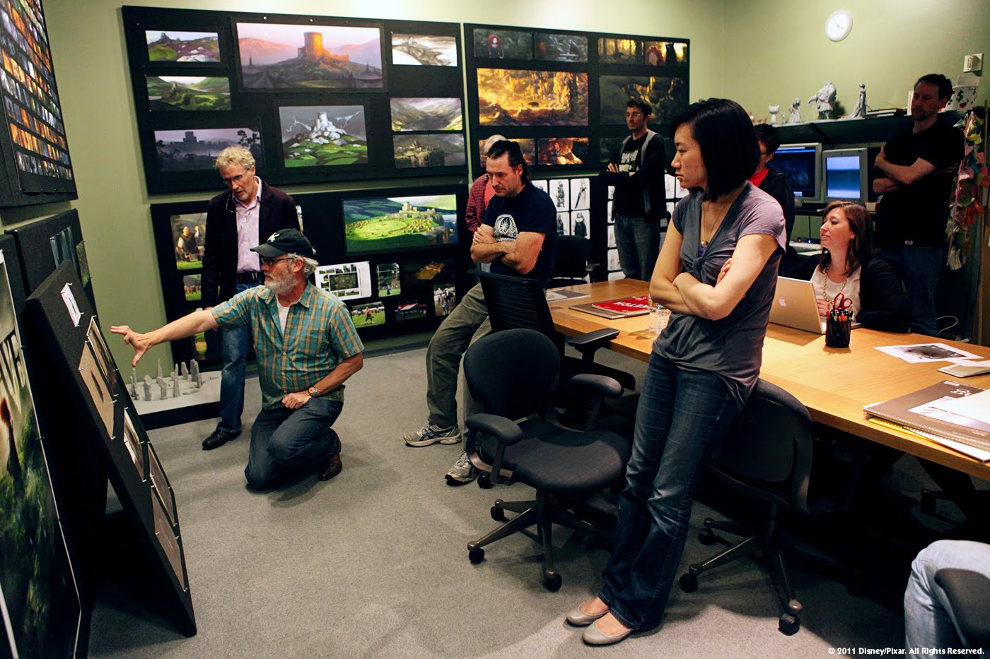
What was it like working at Pixar?

I am asked this question often. It's a shame how few people know what working at Pixar is like given the creative and commercial success of this unique environment.

For me, answering this question is tough. Having worked there for over the 15 years, both I and the studio had changed quite a bit over that little stretch of time--the studio having grown from about 300 to nearly 1200, while I went from my mid-20's to my early 40's. There is so much I can say, but for the sake of this post, and giving an answer that is honest, but as objective as possible, I'll try to create a picture of the general environment at the time that shaped so much of my experience there. But first I'll give a little context to what shaped that environment.

I constantly hear people and companies assert that they want to be the next Pixar. Unfortunately this statement usually means little more than they want to be as successful as Pixar since few, if any, really understand how Pixar achieved its success to begin with. While there were many reasons for this success (more than I could ever know), the most important factor in my humble opinion was the one-of-a-kind triumvirate of Steve Jobs, Ed Catmull and John Lasseter (and I would add John’s unsung former creative partner, Joe Ranft), as forming the specific DNA that truly expressed Pixar's accomplishments. 


With John and Ed's shared belief in the relationship between art and tech—that technology could express beautiful art, and that art challenged and improved technology—Steve's unforgiving demand of creating only the best experiences, and Joe's heart and belief in the creative process, they forged a rare harmony between creative, tech and business driven by a single goal: to tell great stories.

And by also firmly believing that great content is created by great talent, they put tremendous effort and resources into building the most supportive, empowering and humbling creative environment to not just to attract the best people in the industry, but to enable them to do their best.


And yet what is so remarkable about this simple recipe is how frequently misunderstood it has been by people and companies alike looking to reproduce Pixar's success. I have often seen the pursuit of the easy part: the financial investments in cool workspaces, gyms, game rooms, swag and all flavor of employee perks & benefits to attract good talent. But it is the other half of the equation I feel like people too often missed: the hard part of trusting professionals to do what they do best, even if it means challenging the status quo, questioning authority or taking enormous risks.

This was environment I entered into. 

So, what was it like? Awe-inspiring, rewarding, challenging, frightening, hilarious and exhausting. Pixar is, and I trust remains, a culture of perfectionists, over-achievers, visionaries and risk-takers, which by extension unfortunately includes a depressingly high percentage of insecure employees saddled with imposter syndrome, (myself having been high among them). 


No matter how smart or talented or successful you were before Pixar, coming into the studio was humbling because everyone operated, or at least give the appearance of operating, at an intimidatingly high level of achievement. For the initiate, Pixar’s iterative process was grueling, ego-bruising and demanding. Naked, unfinished, in-progress work was constantly subject to the criticism of peers, leads, art directors, production designers, directors, and just about anyone with a good eye and a valid comment. Bi-weekly reviews in front of dozens of team members could be exposing, nerve-wracking, and often lead to a worry that one was simply wasn't as good as everyone else, which if left unchecked, would slowly gnaw away at one’s professional confidence and could only be combated by working even harder to prove oneself worthy again.

Yet on the flip-side, it was inspiring, fun, exciting and encouraging to be in the company of so many talented and supportive peers, to earn the respect and approval of so many accomplished superiors, and to take part in creating something so large, so new, and so incredible that it could hardly even be imagined. 

Where there was fear of failure there was determination to succeed. Where there was doubt and struggle one day, there was confidence and pride the next. And whenever one felt overshadowed or outgunned by the level of competition, there was incredible camaraderie, team-work and a collective drive to bring out everyone’s best. At least this was how it felt for me...day-by-day, up-and-down.

Over time, as I settled into the rhythm and flow of Pixar’s creative drum beat, I found my own pace and confidence and learned to revel in the process of tearing work my apart to make it better, of going in circles to confirm the right choices, to look at my own work and the work of others with an ever sharper eye. I learned that concept design was not just about producing a design, but exploring all the possible options to find the right design. I learned to research everything, to know my subject better than anyone else, to look at the world around me to inform the smallest details of even the most imaginative designs. 

I learned to become a good designer by first asking the right questions. I learned every film at Pixar was like a working for a different company: each director-producer team formed a unique culture that infused the entire production; each production designer had different taste and judgement, different priorities, different strengths, expectations and ways of communicating. Early on, much of how I learned to work on one film was discarded on the next, until eventually I learned how to become an empty vessel capable of holding whatever I needed to hold. 

But there were systemic challenges inherited from the long traditions of Disney feature animation, that in combination with the complicated mechanics and demands of a CG pipeline, made Pixar’s filmmaking process essentially a giant assembly line. To manage the long, complex task of making an animated film, productions were broken down into numerous distinct stages, each stage managed by specific departments, each department served by dedicated roles that could last months to years. 

Over time this process tended to turn artists and engineers alike into specialists. Efforts to mitigate risk encouraged repeat performances. Career-long leads, like team captains, hand-picked their reliable go-to’s. Type-casting and skill specialization became almost impossible to avoid. For most I think it was a fair trade in exchange for job security, professional pride and skill mastery. For myself, however, this was particularly challenging. I first came into Pixar with a fairly broad skill set and was lucky to enough to have some mobility between roles, but eventually I became so specialized that I could no long fight typecasting and eventually reached that point of having to decide if I wanted my career to be defined by my job, or if I wanted my career to define my jobs. 

Another by-product of assembly line compartmentalization was a tendency for departments to stick to their own and at times form cliquish cultures, interests or goals relative to their own position within the larger structure. Story, Art, Animation, and the various subsets of Technical felt like different hierarchical clubs with differing traditions, personalities, and politics. Infusing all of them was the subtle ever-present sense of friendly Pixar competitiveness: to be the best, the funniest, the smartest, the biggest partier or the most popular. 

Yet on the flip side again, Pixar had a wide demographic range of gender, ethnicity, age, persuasion and background (at least in relation to the historically male-dominated entertainment industry), and everyone there was of the highest pedigree, whether the most accomplished in their own fields, or just brimming with pure talent and potential. Across the board, Pixarians were mature, professional, collaborative, and fun. And because of Pixar’s focused creative culture, everyone swam together like the school of fish at the end of Finding Nemo, pulling together under the inspiring leadership of Ed and John to make the best films possible. 

Making films at Pixar was hard work, but it was work that was fueled by an especially combustable concoction of personal pride and dedication, fear of failure and the unknown, trust in the process and one's peers, and hope that no matter how long and arduous the process, it would yield something worthy of standing the test of time. It was like like rowing a boat at sea, toiling over the open ocean for months or years on end, our destination little more than a mark on a map for most of that time. We’d work hard together, play hard, struggle, sweat and press on if with only faith of the vision in the director's mind and our own trust in ourselves capable of getting us there. Eventually, usually very near the end, something would appear on the horizon, and if all went well, which it did less than you might think, it would grow larger and larger until we eventually found ourselves thrust on the shore of something far more beautiful and amazing than anyone of us had even even imagined.

At least that's what it felt like. Or I could say it was like sitting at a desk staring at a computer monitor 10 hours a day, 5 days a week, months on end, along side hundreds of peers. But that’s not quite as interesting, is it?

If there's interest, maybe I'll go into other aspects of my experience at Pixar in later posts. Having been gone for over 5 year, now, I'd also be delighted to share the views of other Pixarians. 

For a more detailed example of my day to day experience working on Wall-e, check out this old 2009 Thunder Chunky interview


Thursday, June 30, 2016

College degree?


Here’s a question I am often asked by folks looking to break into the entertainment arts:

Is a degree essential to an career in the entertainment arts field?


I think this answer can vary depending on the exact role one pursues. However, in the most general sense the safest answer I would give is: 

Yes. 

And No. 

Given that I effectively dropped out of college after just two years, it could be argued that a degree was not important in my case. 


However I would be remiss to not point the timing: I broke into the gaming industry just as the arrival of CD-ROM helped usher the end of programmer-
art and give rise to ‘real’ digital art. All of a sudden g
ame companies couldn't hire digital artists fast enough as there were no entertainment design degrees and very few artists even versed in the relatively unsophisticated art software at the time. 


It so happened I had strong art chops plus actual computer art skills thanks to experience I had accumulated during shot my time in college, working for the college. It so happened I didn’t need a degree to get my break because I entered the field when there was little competition and a very high demand for artists. 
In other words, I lucked out.

These days there is no shortage of private, state and trade schools offering robust 2-, 3- or 4-year degrees in every aspect of entertainment design, churning out who knows how many thousands of art graduates around the world each year clamoring for the same few entry-level positions. 

If I was entering the field now, would a degree make a difference? You bet your ass it would! Ask any of my fellow grey-haired industry peers and they will probably tell you the same thing. 

But really? Even with my raw talent, my youthful enthusiasm, and the mad skills I had in Pagemaker and Photoshop 2.0? Does a degree really matter that much??

Honestly: No. 

In my own experience, I’ve never once been asked about a degree, and I have never known it to impact a job opportunity. As a hiring manager looking for candidates myself, I usually give very little attention to someone’s academic credentials. Furthermore, almost every job description I’ve ever read gives the qualification: “college-degree or equivalent industry experience”.

Now, what does ultimately matter is how competitive you are relative to the needs of the position. Do you have the proficiency to produce high quality work? Do you have all the required skills and know how to effectively use all the required tools? Do you have the experience to show you can work under deadlines, collaborate with others, manage your time, take direction, communicate clearly, and solve-problems?

While I assert that a degree in and of itself is not key to a successful arts career in the entertainment field, what is absolutely important is how a degree, or even the pursuit of that degree, makes you more competitive in your field. 

Any good school is a protective cocoon that enables students to learn the tools and craft of their trade, often by industry experts with active networks capable of delivering star students right past company HR barriers into the hands of hiring managers. These institutions offer networks of supportive peers, access to the latest industry equipment, valuable job resources and industry contacts otherwise difficult to attain on one's own.


Of course not all educations provide all of this. With education becoming ever more expensive and student loan costs spiraling out of control, what makes any education worth the cost is what any student is able to take from it. Those who dedicate their time and effort to learning all they can, to being the best they can, are maximizing their competitive edge for those entry level jobs that that can mark the beginning of a career. Those that don't are simply incurring a massive amount of debt.

Taking the alternate path to teach oneself is possible but the burden of self-learning is all the harder. For those already with a foot in the door, one can certainly pursue the career that pays the student, as I did, but this comes with its own risk and trade-offs. My advice in this case would be to treat work as your education, each job a class measured by what it can teach you and how it can make you more competitive for your next job. Otherwise you can find your entire skill set and professional identity shaped by a single job whose goal it is to serve the interests of the company, not your future.

Fundamentally the success of any career is a product of supply and demand. When demand outweighs supply, like it did in my time, one doesn’t have to be as competitive. But when supply matches or outweighs demand, like I believe it has for some time now, then career success is directly impacted by how one is measured in comparison to all the other job seekers competing for the same positions.

Ultimately the goal of a degree is to help you start a career. It is the means to an end. But really the means is just the investment of time, energy and resources you are willing to make to become the best qualified for the opportunities you most desire. 

That, and a good dose of luck and timing!

Monday, June 27, 2016

Learning to Think Like a Designer

For 25 years I’ve worked in the visual arts field—from traditional illustration and graphic design, to visual design and art direction for games, feature animation and tech.

Having dropped out of college early on I never really gained an academic understanding of what the word ‘Design’ actually meant, and across my career my understanding of what good design is has continued to evolve. 


With the advent of my first job as a graphic artist designing flyers, posters, banners and ads for campus events at SJSU, I thought of design as simply what one did with design software—All the flyers, posters, banners and ads I made a were ‘designs’ simply by virtue of having been made with Pagemaker 2.0. 

© 1995 Mark Cordell Holmes
Over my first couple of years this idea began to evolve into a product of aesthetic choice--which dozen or so system fonts were used, which gradient patterns or shapes, how much illustration versus type. Designs were light, dark, sparse, text-heavy, or image-heavy, designations of the visual qualities that comprised them.

This understanding changed as I moved into computer games. Here design was about making things look cool. The greater the level of detail, the more rendering polish and visual complexity the better designed it was—the goal often being to design the shit out of everything.

When I joined Pixar my understanding of design truly began to mature. 

As as a production artist on my first couple of films, I was responsible for translating 2D character, set and prop concept art into production drawings that not only ensured that each design abided by the same rational world scale so characters could fit through doors, and so on, but also resolved the tiniest details so each design could truly function within the 3D world, or at least give the illusion it functioned.

 ©1998 Pixar/Disney

Designs were broken down into ‘packets’ of carefully measured turn-arounds, break-downs, cut-aways and elevations to maximize clarity and consistency as they were interpreted into 3D by teams of production modelers, riggers, and shading artists. Production art demanded a mindfulness for detail that led me to think of design as a process of defining and solving the tiniest problems so each design could serve its needs relative to story.

As I graduated to a designer role, this level of thinking was elevated to an entire character or set. No longer simply a matter of filling in details, it became about finding the right design choices for a given character or set though an in-depth process of asking questions, exploring and discounting options, making discoveries, and circling ever inwards until the right choices were found with respect to the needs of story. 

 ©2004 Pixar/Disney

This view of design as a process of deeply understanding a single person, place or thing in context of story exploded once I learned how to art direct. At Pixar, art directors manage the look, communication and consistency of different visual disciplines—characters, sets, textures, light & color, or even graphics. As designs cross through the 3D pipeline from art to modeling to rigging, shading, and lighting, passing though multiple hands, it falls on the art directors to maintain design integrity across all designs within their discipline. And as no design exists in a vacuum, every design is informed by the designs around it—how big a character looks is very much relative to the size of other characters and objects around it—art directors are always mindful of how all designs relate to each other within their discipline, within the service of story.

When I stepped in as art director on Wall-e, and became responsible for establishing the visual style of every graphic element in the Axiom, I needed to develop a design logic that that not only established a meaningful relationship of type, iconography, pattern, color, shape and motion between the graphic elements themselves, but that also worked in conjunction with the all the environmental, story, performance, camera and lighting decisions in context around them. 

Original matte painting by Paul Topolos  ©2008 Pixar/Disney

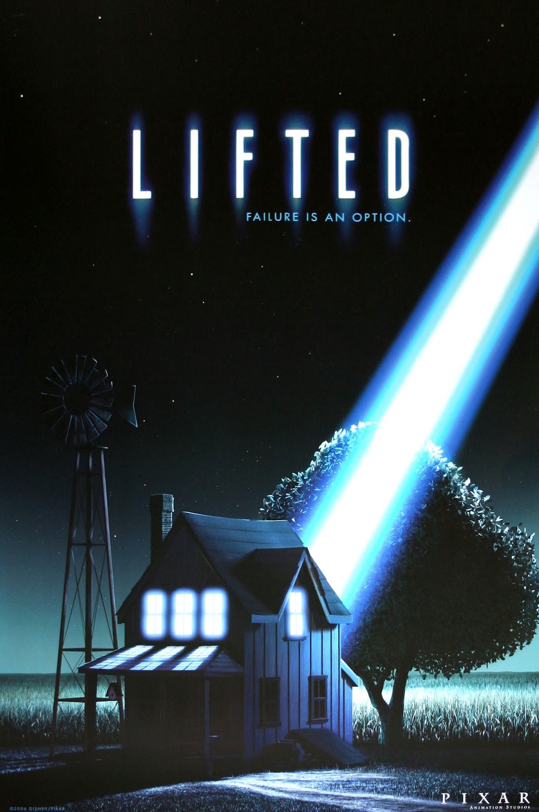
While this experience opened my eyes to the sheer complexity and problem-solving that design entailed, my real understanding of design came with production designing 'Lifted'. 


For this film of just 5 minutes, I was responsible for the look of every visual element in every shot. My varied learnings up to this point—the arbitrary use of design elements, to making things look cool, to solving the laborious details, to owning a single design, or an entire design discipline—all fell short of the task ahead of me.

At Pixar, production design is basically the process of interpreting and relating story intent into cohesive, consistent and compelling visuals, from the thoughtful design relationship of characters, props and sets, to the orchestration of all the visual design elements: composition, staging, light, color, form, space, depth, an so on. 

As the relationship of image to story helps communicate information, elicit emotion, reveal character, and convey subtext, production design requires an intimate understanding of the creative intent of not just the the film as a whole, but the dramatic progression from scene to scene, the intent of each shot, and a sensitivity to how any detail, no matter how small, can help convey story intent.

©2008 Pixar/Disney
Of course, as much as I learned at Pixar, my understanding of design did not stop there. Returning to games with Dynamighty enabled me to think of design as a mode of thought and problem-solving. Here I had the opportunity to help craft an interactive experience defined by completely different set of constraints, goals and needs. And for the first time I was not approaching design as a service provider visualizing someone else’s voice, but as a co-author author articulating my own voice. 

©2014 Sony Computer Entertainment

Art directing Counterspy expanded my consideration of design as not just the use of visuals to support a carefully constructed narrative, but as the means to crafting a user experience and fulfilling a core player fantasy in service of game design. This entailed communicating goals, supplying user motivation, shaping an immersive and engaging world that supports player fiction, and establishing clear visual gameplay systems.

©2014 Sony Computer Entertainment
From the games space to the tech world of Google, my understanding of design was stretched again. Illustrating and leading Doodles, where design was used to capture the curiosity of billions of internet users around the world within a 500x200 pixel space, as well as to help bring more user delight to a range of Google products and services, I discovered that the heart of the Doodle team was about bringing a soul to technology through artistic expression and the celebration of humanity. 


© 2015 Google

Over my career I’ve applied many of these learnings into a series of cinematic design talks on visual and emotional storytelling as it relates to film, animation, and even writing as I routinely apply design thinking to my own script and novel writing.

Since then, I have come to see design as a broad process of understanding, problem-solving and communication, where the success of execution is only as effective as the design thinking behind it. While perhaps far from academic or complete, my understanding of design is being expanded once again as I now consult with Virtual & Augmented Reality companies to help them craft entirely new visually immersive experiences. 


So what I have gleaned through all of this? 

Visual design is a means for crafting experience, whether expressed through movie screens, computer screens, mobile screens, virtual reality or words or pictures on the page, imagery is a means of capturing people's imagination, to distract, amuse, inform, engage and powerful illicit feeling. 

What is successful design? You know it when you don't just see it, but you feel it.

Monday, June 20, 2016

Why Story by Design?

This Story by Design blog is a collection of learnings, processes, observations and inspirations I’ve collected across my career. 

In my posts I’ll share lessons learned from some of the animation industry’s best directors, storytellers and craftspeople I’ve had the privilege of working with over my 16 years at Pixar; I’ll compare my experiences moving between feature CG animation, computer games and tech, including my approach to art directing the BAFTA-nominated game, Counterspy, and designing Google Doodles; I’ll give observations and analysis of visual storytelling in feature film and animation and discuss my thoughts on experiential design for VR; I’ll post inspirations and anecdotes, answer commonly asked questions and hopefully feature some wisdom of industry peers more knowledgable than myself.

A few reasons for starting this blog: 

When I taught two courses on Production Art for 3D Animation at the Academy of Art in San Francisco several years ago, I found the time commitment too great between teaching, working full-time and being a parent of young twins. But I discovered that I truly enjoyed teaching and helping others, which perhaps stemmed from being largely self-taught. I also quickly realized I couldn’t teach what had I learned through doing without a more academic understanding of how and why I was taught to do things this way. Teaching became as educational for me as for my students, if not more even more so.

Over time my continuing desire to teach led to my lecture series on Cinematic Design and Visual Storytelling which I have taken to universities, companies, events and conferences around the San Francisco Bay Area. With this blog I intend to expand these concepts around a wider framework of visual-emotional storytelling to encourage a more meaningful approach to visual design informed by emotional or narrative considerations over simply aesthetic or stylistic ones.

I believe what elevates a well-crafted work beyond thee conventions of technique, form or genre is emotional connection, with the capacity to emotionally move an audience as the heart of true artistry. As I have always been drawn to the creative work of artists who express their own voice and points of view, I believe the more honest, original and meaningful an expression the artist brings to their work, the more truthfully, personally and meaningfully it can resonate with an audience. 

With this blog I propose that successful visual storytelling is equal measures art and craft—that is ART as WHAT idea is being said, and CRAFT as HOW that idea is visually expressed. With so much attention already paid to the ‘How of Craft’, with its answers, rules, guidelines and conventions, I hope to bring some attention to the more nebulous ‘What of Art’, which in my experience is usually a process of first finding the right questions to ask. 


At a personal level I am using this blog as an exercise to further develop my own artistic voice and better craft my thoughts on emotional design. I am very much still a student and I am not sharing my particular experiences and perspective to prescribe answers or assert myself as an authority. Rather I want to encourage thought and discourse on good design, and if I can offer any value, insight or inspiration to artists and storytellers, it would be to dare you to seek out your own artistic voice that you might create expressive work more meaningful to both yourself and your audience. 

And if you just happen to get to that place, let me know what it feels like!
:-)